
“I don’t need another dashboard. I need one number I can defend to an auditor with a straight face.”
That was the CFO at a mid-market lender we’ve done work with over the years. It was six weeks after her team had finished building a new executive reporting view. The dashboard was clean. Real-time. Color-coded. And she still couldn’t answer the only question that mattered: When the examiner pulls this delinquency number from the system, will it match the one I just showed the board?
Defensibility and speed are not the same problem. Most institutions spend their money on speed.
The reflex that doesn’t fix anything
When an executive stops trusting the numbers, the first instinct is to buy a better way to look at them. Another BI tool. A cleaner dashboard. A faster refresh. It feels like progress, because you can often see the result on a screen by Friday.
But a dashboard is a window. It shows you what’s already in the room. If three teams walk in with three different numbers for the same metric, a prettier window doesn’t reconcile them. It just renders the disagreement in higher resolution.
The reconciliation tax
Here’s what that disagreement costs before anyone even argues about it.
In banks, more than 90% of data users say the data they need is often unavailable or takes too long to retrieve, and 81% call data quality a top challenge (Deloitte, 2026 Banking and Capital Markets Outlook, citing its 2024 Banking and Capital Markets Data and Analytics Market Survey). Your analysts live those numbers every day. They burn hours cleaning and reconciling data instead of analyzing it, so at a mid-market shop, whole days a week go to confirming numbers rather than moving them.
That’s the tax you pay for not owning your definitions. You pay it every reporting cycle, every board meeting, and every exam, and it never converts into a one-time cost.
How to tell if you actually own a number
Ask four questions about any metric in a board or compliance report:
- Which system holds the source data?
- Where is the calculation logic applied?
- Which definition is authoritative?
- Who approves a change to it?
If you can’t answer all four, the metric already exists in more than one version. It doesn’t matter how clean the dashboard looks. The visualization layer was never the bottleneck. The definition layer is.
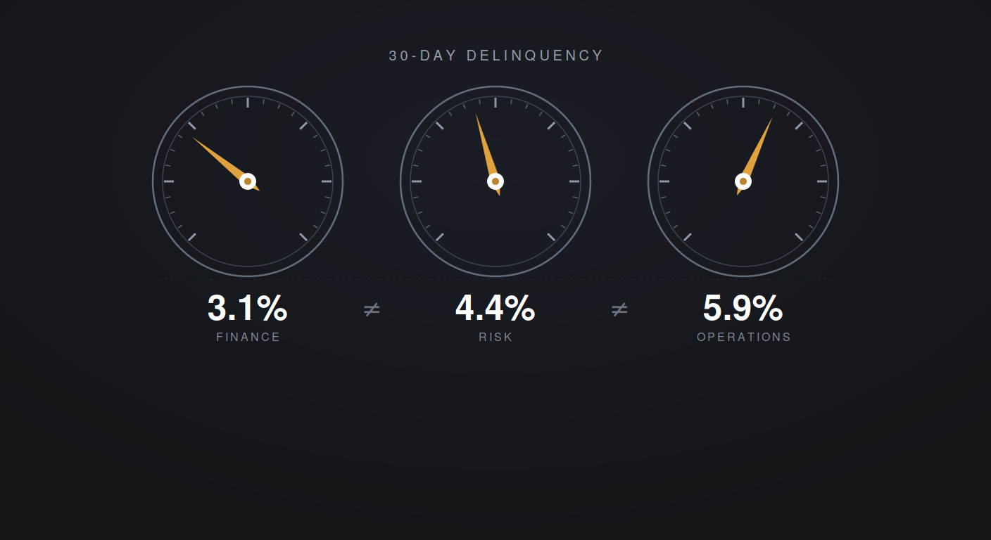
This is the part that catches people off guard. Most institutions read this as a tooling problem, and the tooling budget will not touch it. Nobody wrote down what “30-day delinquency” includes and excludes, which system is the source of record, and who’s allowed to change it. So Finance, Risk, and Operations each made a reasonable assumption, and now you have three numbers and a steering committee that opens every meeting by arguing about whose data is right.
Why this got more expensive, not less
For a while you could live with that. Expensive and irritating, but survivable. What changed in 2026 is the opposite of what most people assume.
The federal banking agencies moved supervisory attention away from documentation and process. In August the OCC and FDIC codified it in a joint final rule, and Comptroller Jonathan Gould said examiners and institutions should prioritize “material financial risks and substantive violations of law over concerns related to policies, process, documentation, and other nonfinancial risks.” Michelle Bowman, the Federal Reserve’s vice chair for supervision, reviewed the Fed’s outstanding Matters Requiring Attention and downgraded the ones citing documentation gaps rather than threats to safety and soundness.
So if your plan was to fix your reporting because an examiner would eventually make you, that plan expired this summer.
The exposure moved rather than disappeared. It now sits in the decisions you make off the number instead of in the binder behind it.
Here is what that looks like. Your delinquency number moves 30 basis points. You tighten a segment. Two quarters later you learn the portfolio never moved, a definition did, and you turned away business you should have booked. Nobody wrote you up. You simply made a worse decision than your competitor, using data you believed.
This is not hypothetical, and it does not only happen to institutions with thin data teams. On August 11, 2026 the Federal Reserve Bank of New York published a paper reconciling why its own credit card delinquency measure had diverged from what lenders were reporting. Lenders had begun reporting charged-off debt on credit files for longer periods. The 90-plus delinquency series jumped. The change was in how lenders reported, not in how consumers paid. That chart circulated widely as evidence of household distress before anyone caught it.
If the best consumer credit data shop in the country can put a reporting artifact in front of the public and have it read as a trend, the bank running board metrics through eleven systems it inherited from acquisitions is not going to catch it either.
The floor came out in April
There is a second change many institutions have not absorbed. On April 17, 2026, the Federal Reserve, OCC, and FDIC issued revised model risk management guidance, SR 26-2, replacing SR 11-7, which had governed this since 2011. The new guidance states that it “does not set forth enforceable standards or prescriptive requirements, and non-compliance will not result in supervisory criticism,” and that it is “expected to be most relevant to banking organizations with over $30 billion in total assets.”
It also narrowed what counts as a model. Spreadsheets and deterministic rule-based processes now sit explicitly outside the definition. The OCC separately rescinded Bulletin 1997-24, its credit scoring examination guidance, with nothing replacing it.
Put those together. If your board’s delinquency number comes out of a spreadsheet, that spreadsheet is not a model, carries no validation requirement, and has no named owner under anyone’s governance framework. The annual validation expectation is gone. And if you are a mid-market institution under $30 billion, the guidance says it probably was not aimed at you in the first place.
The floor under your reporting layer was removed in April, and nobody replaced it. Read that as relief if you want. The more useful reading is that whatever discipline exists around your numbers now has to come from inside the building.
Which gives you a fifth question to ask alongside the other four: Which numbers in your board deck come out of a spreadsheet that nobody validates and nobody owns?
The wrong race
So the race everyone’s running, speed to visualization, is the wrong race. Spinning up 20 views faster than anyone else wins nothing. The institution that wins is the one that can produce a single number and, when an auditor asks, walk the lineage all the way back to the source without breaking a sweat.
One defensible number beats 20 unreconciled ones on demand. Especially the morning you must act on it.
What actually solves it
This is the problem GOBLIN was built for. Not another reporting layer stacked on top of the mess, but a governed foundation underneath it. Source data consolidated from your legacy systems into one place. Definitions applied consistently, so Finance, Risk, and Operations are reading from the same book. Lineage you can trace. Access controlled by role. The dashboards come with our normal Risk Support. What makes them defensible is what sits behind them.
PAG’s team has built this for top-tier banks and stood it up for mid-market lenders who needed it running yesterday. One regional bank came to us carrying eleven legacy systems from a run of acquisitions, and executives who could not see how their own products were performing. We consolidated the data streams, rebuilt and validated every report they already had, then delivered more than 90 new ones on an automated schedule. Reports land by 6 a.m. Internal data and FTE costs came down 35%.
If your teams are still walking into meetings with three numbers for the same metric, that’s the conversation worth having.
David LaRoche is managing partner, U.S. Operations, for Predictive Analytics Group, which helps clients cost-effectively bridge the gap between analysis and impactful strategic or tactical decisions. To learn more about how GOBLIN can consolidate your data environment and accelerate your AI readiness, schedule a discovery call with us. Or you can schedule a no-obligation consultation to discuss how we can help with your defensibility changes.
Updated 9/25/26